Part Five: The Paper Museum – Assignment Five

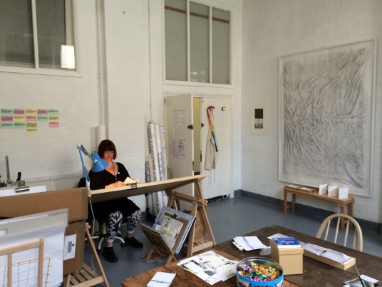
Made it to the last assignment, essay completed and looking to curate a series of pictures and various mediums to show this. The initial title was “Depicting your environment” which didn’t grab me. In the last course, during this one I’ve found that a subject has to really interest me in order to have a proper go at it. This course in particular has taught me the importance of narrative and meaning however deep. Why would I want to depict something that in all honesty I want to escape and at the least detach myself from?

I read further in the coursework material that I could “curate” images, tell a story and even use an alter-ego to present these. I’m thinking I have and in…

The above five images are paintings (All oil colour, 20 x 30″ on canvas boards) I produced for my final assignment – in my last course – The Practice of Painting. The theme was formed and a response to a visit to the Somme battlefields. The series was named “The Language of Ghosts” and explored not just looking back, but the artists researched and their influence on me as well as the experience.

I’ve felt since that the above works were never fully realised and my experience wasn’t committed to art. We are in the midst of the centenary of World War One and wanted to explore this further but with a slightly different angle, possibly a more personal one? I’m not sure the assignment brief would allow this but I think the idea ticks most of the boxes.

The idea of an artistic soldier is not an new one, most of my own painting heroes were. I have recently read War and Turpentine by Stefan Hertmans – a well written account of his grandfathers account of the First World War and life experiences. The Guardians review link is below.

https://www.theguardian.com/books/2016/jul/02/war-and-turpentine-by-stefan-hertmans-review

This book and its effect on me is the premise for my collection of works for this assignment. I guess you’d have to read the book to fully understand the story, but hope that this series will capture some of it and add context of what I’m trying to say?

My role as blogger now becomes fictional narrator of a side story linked to Hertman’s true story of his late grandfather Urbain Martien (1891-1981).
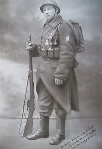
 

thDJ70JTYR

Urbain Martien


The story starts in Windermere, the Lake District and not Ghent in Belgium. I was approached by a descendant of Mrs Lamb, a nurse who looked after Martien, to put together / curate a series of artworks for a centenary exhibition. The works produced by him were during his convalescence in Windermere during World War One. These works were left to her as a thank you before he went back to the front in Belgium…


WP_20170716_20_16_26_Pro (2)

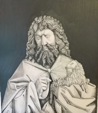
John The Baptist, After van Eyck – Graphite on Paper, A3


The drawing above is taken where Urbain started as a gifted artist before the war in his home city of Ghent, Belgium. It’s John the Baptist, a detail from The Ghent Altarpiece of which he was very familiar with. The van Eyck brothers and the Northern Renaissance has held a fascination for me, and one day will get to see the real thing so it seemed fitting to start with this work (It took over 20 hours work so its going in!)


UK-NWE-Flanders-x

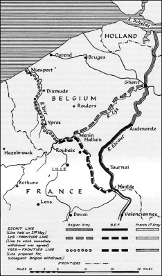
The above image, I hope gives a sense of place of where Urbain Martien served and adds context leading into the next set of drawings given to Mrs. Lamb – never did find out her first name…

WP_20170714_20_02_02_Pro (2)

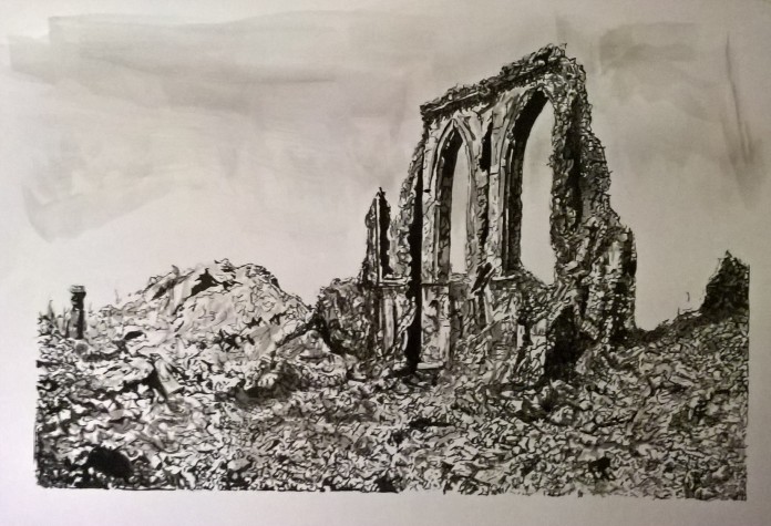
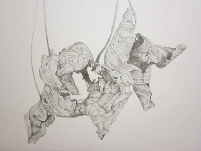
Demolished Church at Dixmude. Black Ink and Wash drawing on paper, A3

The above drawing is of a demolished church in Dixmude. This had special resonance for Martien, as it was a church he had visited as a child, but also his father who was a painter and restorer himself, worked here. Now all that remained was rubble and memory.

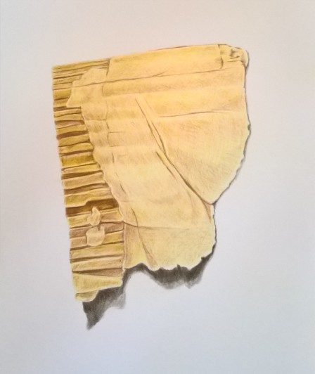
From this Mrs. Lamb presented me with some further ink drawings, in sepia ink this time – these seemed to me more “action shots”- quick, fluid gestural mark making and  with more meaning in truth and add some substance as soldiers are in it too. The three drawings below are of a gas mask issued to Martien, Two soldiers on duckboards after the deliberate flooding of the polders using the River Yser and two soldiers reading a map in the trench  where Martien was stationed.

The war was now becoming very real, the next sketch was of a friend injured from a snipers bullet. Theo took a shot in the face, lost sight in that eye and never recovered even though he survived the war – “are we the lucky ones?”

This is a heartfelt sketch, the face is well rendered and very human.

WP_20170722_22_07_34_Pro

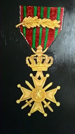
The above image is one of three decorations awarded to Urbain Martien. This one is the Belgian “Croix de Guerre” received for bravery…

The final image of the series is one of the most recognisable flowers and symbols of World War One – the Common Poppy, also Belgium’s national flower. Painted in the delicacy of watercolour, shows the beauty and fragility of nature


WP_20170723_15_41_36_Pro (2)

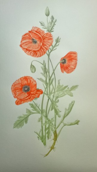
Papaver Rheas – Watercolour on Paper, A3

I found producing this series interesting in that it’s satisfying an itch and interest that is producing art borne out of war and conflict. Not to glorify it, but create my own lens of understanding the past. The creative arts, not just painting but photography, film, poetry and sculpture act as a language to memory in its own right.

All the pictures above, are from found images in keeping with the course as a whole. For mediums, I chose the ones I was most comfortable with, fitting with subject matter and the ones I think I have made the most progress throughout the course. Graphite, Watercolour, Ink and Oil Colour. Some pictures are looser in style and others highly detailed and trying to portray the mood, subject matter and the skills I have gained.

For artists that have influenced me regarding this assignment are possibly obvious? Jan van Eyck ( The Ghent Altarpiece), Goya ( Disasters of War – the wounded soldier particularly), Muirhead Bone, Deanna Petherbridge (Dixmude Church) and Maria Sybilla Merian( Poppy)

I’m relatively happy with this, and the subject for me will be one I will pursue much further… Over to the tutor now….


Bibliography

Jay Winter (2017) War beyond Words, Cambridge: Cambridge University Press.

Stefan Hertmans (2017) War and Turpentine: A Novel, London: Random House.

PAUL VAN PUL (2006) IN FLANDERS FLOODED FIELDS: BEFORE YPRES THERE WAS YSER., Barnsley: Pen & Sword Books Ltd

Standard

Part Five: Exercise 5:4

The course material asks us to make three studies of some packaging or rubbish. Ideally based on a limited palette akin to Giorgio Morandi or Alex Hanna. I was looking forward to this for two main reasons. Firstly to really try and use this limited palette again which intrigued me so much when researching Vilhelm Hammershoi as well as Morandi and Hanna. Secondly, the interest in presenting the mundane, the focus on singular items seems to be more prevalent in my thinking and artwork as I’ve progress through this course.

I chose Oil colour as the medium of choice to me and felt more comfortable regarding the image making I had in mind. The subjects; some broken China, a lightbulb and a paper bag from my chemist.

WP_20170607_21_48_51_Pro (2)

The painting above is the first one produced, painted in three colours in quite thick impasto style stokes. After making a quick drawing, I went straight in with the paint. The colours used were Warm Grey and Cool Grey from the Sennelier oil colour range and Titanium White. In truth, I should have mixed my own, I hadn’t used this range before and thought they were far too oily and a little disappointing in performance. The white added much needed bulk and even after sitting the greys on cardboard to soak the oil up felt they were too “wet” for my liking.

The composition is basic but robust I think and happy with the contrast between cool and warm colour. The white is dominant, I deliberately took the branding of the chemist off to aid this but using the cool and the warm grey’s to create the form. Not bad start and in keeping with the exercise criteria.

For the second image, I used a similar palette for the broken china. This time I mixed my own colours, much better tonal range and a stronger result. I used Ivory Black, French Ultramarine, Raw and Burnt Umber with Titanium White.WP_20170611_12_24_25_Pro (2)
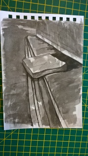
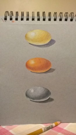
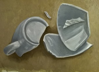
I really enjoyed painting this, probably shows as the strokes have more conviction without my obsessive approach to detailing and I did pay more attention to the tonal values and the production of the china forms. The neutral palette here has worked very well in creating this picture and gives me heart that I can produce work like this and have potential to push on with it. Chuffed
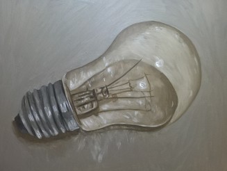
For the third study, I chose a lightbulb possibly feeling a little cocky from the success of the above broken china painting. Its based on a drawing from my more doodles page, here and wanted to really have a go at something tricky to be honest. Glass is tricky to pull off in any medium to look convincing so setting myself up for a fall here!

Using the above neutral palette again excluding the French Ultramarine, I was feeling fairly confident…WP_20170611_16_48_05_Pro (2)

So the above image is the final painting, pretty much done in one sitting, which is a miracle in itself. The glass/Bulb I was really happy with but a little critical of the Edison fitting, lost my may in terms of real accuracy. Overall its not a bad effort and again, shows off the neutral palette off really well.

This exercise, probably plays to my what I think are my strengths. Keeping the drawing going, even if the head isn’t in the right place to paint has been integral in producing the above works and to keep motivated in this late stage of the course…and its been a struggle at times…

For a bit of fun, and sort of fits in this exercise in terms of packaging but not the neutral palette per se, more limited palette. The painting was copied from a drawing by Mark Crilley of this well known chocolate bar. Painted in oils and for me quickly using fairly thick brush strokes which came out well. A good stress buster, and yes I did buy one of these and ate it whilst painting, obviously for research purposes and inspiration…

WP_20170418_22_45_19_Pro (2)

Down to the business end of the course and the Part Five Assignment – The Paper Museum…eeek


Standard

More Doodling….

In between exercises, I feel the need to draw again – nothing heavy, without having to justify why, why, how etc just some random images I found. My interest is waning a little and becoming somewhat fed up and just want finished and assessed, below are some of the recent drawings as part of the therapy lol…

Back to some real work I guess, but glad I did them and pretty chuffed with them too…


Standard

Part Five: Exercise 5:2

This exercise is fairly reminiscent of one I produced for Drawing 1 many moons ago. In a nutshell, produce a study of a walk five minutes from your house. This culminated as the course text suggests in, five diluted Black sketches on postcard sized paper along with five watercolour sketches at the same size.

In truth, I currently don’t go out in the real world painting much, I find it daunting sketching in public, much easier to take a quick snap on the phone for reference. My downfall is that I don’t translate that thought quick enough to a sketchbook further so the moment in some respects is lost, as is the thought process.

That said, this is the first exercise in some time that I actually committed to sketchbook rather than germinating the idea in the head then running with it. Although, my view is that the use of found images on this course has subconsciously given me an excuse not to use the sketchbooks more. First up are the diluted Black ink sketches on A5 Sketchbook paper – tinted with a pale Yellow Ochre wash…

WP_20170529_16_19_09_Pro (2)

The image to the right was my first sketch – No. 39’s Wheelie Bins – Quick, not badly detailed and happy with the tonal values in it.


WP_20170529_16_19_38_Pro
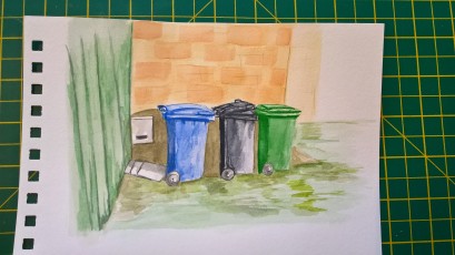
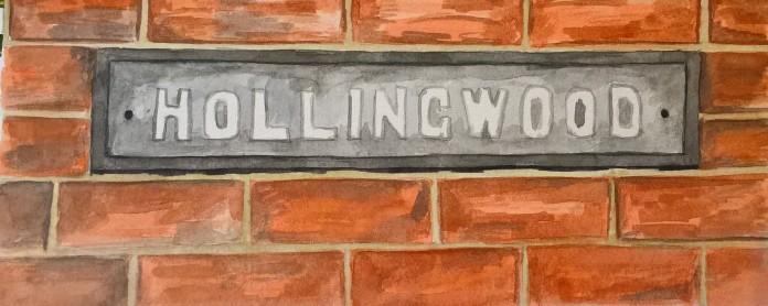
Once past the house, it was up the hill and through some garages and this was the second image of the series. Ok, as an image it looks almost clichéd but I liked it and another ticked off. Not too bad I thought and off to the park I thought to see what I could find there…
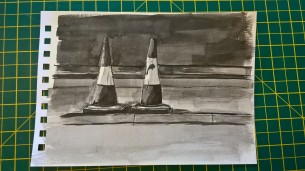


Before I could get to the park, the main road has to be negotiated – of which luckily for me, in some respects had the remnants of some road works – Sketch three below – which is my favourite of the five B/W works I produced. Compositionally stronger and tonally quite good too…WP_20170529_16_19_19_Pro (2)

Sketch Four, is a more straight up and down picture of a rotting tree stump, nothing flash. Happy with itWP_20170529_16_19_01_Pro (2)

WP_20170529_16_18_53_Pro (2)

The above sketch is the Fifth and final sketch in the series – probably the more accomplished of the five, in truth spent the most time on it. Tonally and compositionally strong and most likely to be realised as a painting even though the traffic cones is my favourite.

For the Five watercolour sketches – the route was something similar, and three of the sketches were produced when I did the B/W versions. Cheating a little bit, but quicker and more practical. So, for the first sketch I returned to the first picture of the wheelie bins. See below. I think the B/W version helped for establishing tonal values to start with enough detail to add interest without fully realising the idea. Happy with it

WP_20170529_16_18_41_Pro (2)

and onwards to more deja vu, the garages. I decided to replicate the mattress image again – 3 basic primary colours + paynes grey – it came out ok…

WP_20170529_16_18_15_Pro

Just around the corner from the above, I stopped to paint the image below – garage door with traffic cones, surely a winner?

WP_20170529_16_18_27_Pro (2)

For sketch Four, I returned to the tree stump again – to see how that would work. I went a little mad, and the real life version is not that green! I prefer the B/W version in hindsight as it has more mood and character to it?

WP_20170529_16_18_00_Pro (2)

as the newsreaders say “And Finally”… is a sketch of s sign, pretty much 5-10 minutes away from all of the above sketches. I was running out of ideas and time but thought this might be good to add context and a sense of place and identity…

WP_20170529_16_15_47_Pro (2)

I enjoyed the sketching joint, and produced some reasonable images to it. The work of George Shaw definitely influenced here, in terms of environment, place and identity. there is also a nod to the pathos he has in his work coupled with a wry humour.

Standard

Part Five: Exercise 5:1

Having survived the challenging Part Four, the Part Five research I ventured somewhat slowly to the exercises, not through the lack of interest in art but domestic circumstances dictated otherwise, resulting into plenty of soul searching and contacting the OCA ref deferring assessment to November, which was a great relief and help… Onwards!

This exercise was to produce a detailed painting of the plants and weeds in my garden or nearby environment. The images in the coursework text by Thomas Hall and Mimei Thompson were not that inspiring to be honest – Would I ever to be able to paint something as wonderful as the painting below by Albrect Durer? chances are no, but. What I did cling to is the coursework material saying from previous research – and that was my in… I think!

Albrecht_Dürer_-_The_Large_Piece_of_Turf,_1503_-_Google_Art_Project

A Great Piece of Turf – 1503, Watercolour, Gouache and Ink on Paper, 408 x 315 mm


The above picture is revered as one of Albrecht Durer’s masterpieces, although developed as a study, to me the work is much more than this. The arrangement of the grasses and puddles are seen from the insects eye view and in some respects looks like an accidental photo rather than a cleverly composed one. Durer, to the contrary leads what seems to be a random snapshot of nature through a complex composition matrix. The tallest grasses divide the picture widthways into the harmony of the Golden Section. Ordered and proportioned , the apparent chaos loses its casual confusion. In its hidden symmetry, its an example of divinely created growth.

Following on from my research, I came to yet again the work of Maria Sibylla Merian for inspiration and produced the following painting of the Dandelion. I used HP Watercolour paper as the substrate with a thin wash of Light Red as a background colour, thinking brickwork as a backdrop for the flower.

WP_20170728_11_00_58_Pro (2)

For the painting, like Merian and Durer I used Gouache as the medium to work with over a detailed drawing based on a Merian engraving. Due to the warm weather I employed the use of a wet palette to help keep the paints moist and last longer. A device I use more for Acrylic painting  but worked well and helped immensely.

Couple of hours later the above pictures show the final painting with a few detail shots from my phone. In the end I deliberately left out the brickwork background as I thought it had the potential to drown out the bright yellow of the Dandelion. It also shows a nod to the works of Merian and the relatively plain background of the Durer painting above which also has a Dandelion.

As an exercise, did I learn much? – possibly not just further practice with the Gouache medium and creating detailed work which I prefer, so kind of in the comfort zone with this one… Happy with the picture and should satisfy the criteria of the exercise. Another down and onto Exercise – 5:2


Standard

Part Five: 1964 – A Bloodline of Muted Tones

As part of Part Five, we as students are asked to create a brief essay/abstract on a particular painting medium and below is my effort….

1964 – A Bloodline of Muted Tones

This essay will explore, compare and contrast the work of two painters Giorgio Morandi and Alex Hanna. The title for this short essay is 1964 – A Bloodline of Muted Tones. This stems from the year of Morandi’s death and the birth year of Alex Hanna with the bloodline term as artistic legacy from one to another. The muted tones is reference to the colour palette that both painters have used, rather than the obvious rich deep red hue associated with blood.


Giorgio Morandi (1890-1964) was born in Bologna, Italy and lived and worked there all his life. Surviving two world wars, German occupation and Italy becoming a republic. In his early career he painted landscapes, with brief forays into futurism and metaphysical painting. Mid and later into his career moving away from the modern aesthetic painting experiments that were current, he became exclusively a still life painter of which he is best known today. The images below illustrate and typical of Morandi’s later output.

Andrew Graham-Dixon in his book, a History of British Art, points to the Reformation as a defining moment in British art. The tradition of the iconoclasts, systematic destruction of imagery and the removal of decoration as being a distraction from pure thought, form and space. This is still prevalent in these austere times in Britain today. Ironically, Morandi never set foot in Britain but his work is highly regarded and still influential and particularly on the British artist Alex Hanna.

Morandi, through his art, using traditional oil painting methods (he mixed his own paints) brings a connection with the past, a bloodline of his own. He was heavily influenced by Paul Cezanne (1839-1906) as evident of picture structure but also his fellow countrymen Piero Della Francesca (1415-1492), Paolo Uccello (1397-1475). This proposes a continuum rather than a fracture. To paraphrase the art critic Waldemar Janusczak” Morandi is one of the more mysterious presences in twentieth century art – he is in all the books, all the collections, but nobody has ever known where exactly where to place him. He is a traditional artist, an inhabitant of the border zones”

Richard Dorment observed “Morandi is a Painter’s painter, and one from whom art students can learn from a great deal”.

Alex Hanna and myself included are amongst the thousands that have benefitted from studying the work of Giorgio Morandi and strive to strengthen the bloodline further.  Alex Hanna picked up this creative lineage when he began to paint a series of still lives around a limited variety of items such as empty pill packets, bottles and bubble wrap. At first glance these feel similar to Morandi’s work. Yet on closer inspection, his choice of subject is more utilitarian, are paintings of which are dictated by function.Hanna espouses “I paint objects from my immediate surroundings, these objects for their qualities and tones. I frequently paint within a shallow pictorial space and find this to be an important part of my work”

The images above represent well the work of Alex Hanna, the pictorial space he uses is evident as is the predominant use of white with a minimal use of colour. These are the muted tones inherited from the work of Giorgio Morandi.

Both Morandi and Hanna use copious amounts of Lead/Flake white (a warm, thick textural white, ideal for their work), which forms the core of their palette. One assumes that the following paint colours are common in both of the artists palettes; Yellow Ochre, Cadmium Red, Emerald Green, French Ultramarine and Ivory Black. Again, this represents a very traditional selection of colours which links back to the old masters, the pigment types may have slightly changed since the renaissance but another thread that links them both together nonetheless. They also used white spirit to deaden the colour further rather than adding Linseed oil which would have brightened the works.

As closer inspection via online and as much as this imagery would allow, the paint handing and the brush strokes are relatively thick and visible but carefully placed. This gives substance to the visual field of paint, and not just the object(s) on the canvas that enables the picture to be made. However, it’s the final painting that becomes the subject, creating an interesting dialogue between the object and the painting.

Furthermore, Morandi’s technique has echoes of Cezanne with influences of Cubism. Whereas, Hanna’s working practice uses a similar palette, the technique is a more traditional Trompe l’oeil style with brush work reminiscent of Jean Baptiste Simeon Chardin (1699-1779). That said, both painters have produced works in their own way that asks us to, stop, observe and carefully study. Morandi, like Hanna’s works instill a truth that is quietly seductive. They reveal that genuine beauty can be found in the mundane and the utilitarian. Using traditional oil painting techniques coupled with heritage of their artistic forefathers, the bloodline even in muted tones is intact, and the undercurrent of style and beauty is as strong as ever.

Bibliography

Paul Coldwell, 2006. Morandi’s Legacy: Influences on British Art. Edition. Philip Wilson.

Michele Fuirer. 2001. Giorgio Morandi. [ONLINE] Available at: http://www.tate.org.uk/download/file/fid/6344. [Accessed 6 May 2017].

Robert Priseman. 2014. Alex Hanna: The Alchemy of Painting, Available at: http://www.alexhanna.com (Accessed: 6th May 2017).

Andrew Graham-Dixon, 1999. A History of British Art. New Ed Edition. BBC Books

Standard

Part Five: Research Point: George Shaw

th2M9FHHZ9

The Man Himself

The third artist for me to look and by no means least is Coventry born George Shaw. I’ve been aware of his work for some time and been a bit of fan. His work for me, ticks a lot of boxes and in truth some of the few highlights in the huge Phaidon books on my reading list.

George Shaw born in 1966, is best known for painting realistic depictions of urban landscapes and woodlands of his native midlands using the medium Humbrol Enamels, normally associated with painting model kits rather than traditional oil colours of his beloved old masters.

The two images above, Home time and the Fall  are from Shaw’s series ” Scenes from the Passion ” painted in 1999. These are the far cry from the 1990’s swaggering Brit Pop arrogance, these are quite quiet and atmospheric. Shaw is four years older than me, so a great deal of the cultural references in his work I can relate to, good and bad.

I’m not sure if George Shaw is a completely nostalgic artist, but these images do have that feel to them, autobiographical you might say and a sense of identity. Paradoxically, I also get that possibly he is mocking and criticising these places, that most of us grew up in. So is he having a go at me too?

You are led alone into the past, down old alleys, garages and streets where the white dog poo . It seems like a tour of where Shaw, had his first cigarette, made a den, or this is where he had his first cheeky fumble with “Sally” for a packet of crisps…. There is an ambivalence to Shaw’s work, an uneasy interaction coupled with a dark humour between nature and the built environment, there are no people in his work which I think adds to the tension.


The four images are above, are taken from Shaw’s relatively recent show at the National Gallery “My Back to Nature”. Due to location and finances I didn’t manage to see these in the flesh unfortunately – pun intended. Shaw enters the woods of his youth, via Titian, Poussin and Constable. He captures these mysterious, moss covered and dark landscapes wonderfully well and creates a visual time capsule. Again, I’m transported to the woods of my own formative years, seeing pornographic magazines scattered in not so discrete hiding places. Shaw reminds us of the past and viewing these images is simply not just what is immediately visible, maybe looking through splayed fingers, just in case of course…


Godrey, T, 2014,  Painting Today, Phaidon Press.

Shaw, G, 2016, George Shaw: My Back to Nature, National Gallery, London

Schwabsky, B, 2004, Vitamin P: New Perspectives on Painting, Reprint, Phaidon Press

Standard

Part Five: Research Point: Tanya Wood

For the second artist I chose was Tanya Wood of which the main source of information is from her own website, here.

tw3

Tanya Wood in her studio

I’ll start off  with words from the artist herself

” Through the art of drawing I aim to communicate ideas concerning our everyday experience of being consciously present. The focus is on fast contemporary life, lived (often obliviously) in constant flux, of change and habit and that which receives our daily inattention. In contrast, my drawings are an act of mindfulness; every detail and imperfection is faithfully transcribed; time is slowed in absorption while hours fly by.

By focusing on a moment, a detail combined with the meticulous rendering of surfaces, places and spaces I hope to provide a space for pause, drawing attention and awareness to ordinary reality in order to experience the present, more intensely. Drawing is my passion and helps me make sense of the world, it is an invitation and opportunity to spend more time looking at our immediate environment and our place in it, to make more of life lived now “

In truth, I had not heard of the artist Tanya Wood before until I picked the course material up. The fact she uses detailed drawing to reconcile thoughts of her world really appeals to me.

I took the above two images from the course material, and instantly fell for them. The detail and rendering of these, generally quite banal subjects (a paper bag and weeds between two paving stones) to become things of beauty. The exude a certain peace, and guess that the artist was when she created them. I can empathise with this, in that I can lose myself when drawing and feel quite free of anything and quite a meditative and cathartic process.

The tow above images, a departure for Wood in relation to just the rendering of a surface shows people going about their business. Her use of negative white space to add dynamism to the figure is very good and loses nothing in the composition. Fascinating. Her technique in drawing is exceptional which also helps to add strength to the work – worth investigating further.

In the interest of art and my own interest piqued by Wood’s work. I wanted to create something similar to see if I could recreate realistic surfaces in pencil. First up, I chose a piece of corrugated board, well why not and I did notice something later in Part Five that mentions this, so hopefully kill two birds with one stone…

WP_20170405_17_44_29_Pro (2)

Corrugated Cardboard, A4 Coloured Pencil on Bristol Board

The work above was produce in coloured pencil on 250gsm Bristol Board. This image looks a little yellower than the original and the photo blue background doesn’t help. I was really happy with this, and looks fairly realistic. Whilst the above work is all mine, the image came from the artist and author Mark Crilley and his book The realism Challenge – a book I turn to quite regularly for ideas and understanding the rendering of particular surfaces. The next image, the foil is one idea from this book too, I hope its not seen as cheating okay, maybe a little cheeky…

Non-metallic metals have been a little obsession of mine for years – all mediums and often wondered how the old masters could produce realistic metalwork without using metallic paint.

wp_20161207_22_59_45_pro

Non-Metallic Metals

The image on the left, think I’ve posted it before was an interesting exercise to try and understand the process of using basic colours to render a realistic metallic finish in coloured pencil. Using colours based on their Oil/Acrylic counterparts and the effect on grey toned paper worked well. I was now time to translate this method in producing some aluminium effect to a white surface…


WP_20170402_13_02_27_Pro (2)

Aluminium Foil, A4. Coloured Pencil on Bristol Board – After Crilley

The above image was produced by using a series of Cool greys, Payne’s grey and Black from the Faber Castell Polychromos range. In all honesty, I could have done this in graphite but needed the practice in using coloured pencil. It went well and I’d like to think in the spirit of Tanya Wood too.

Mark Crilley (2015) The Realism Challenge: Drawing and Painting Secrets from a Modern Master of Hyperrealism, : Watson-Guptill Publications.

Standard

All Gone Pear Shaped…

I guess I’m not on my own when hoarding images from magazines, books etc. in the notion that ” I think that will make a good painting one day” In a moment of weakness, I thought it was high time to sort through the “Archives” firstly to create some space for future work but also finally start some of these ideas off, for better or worse.

In truth, I’ve never been great at focusing these images, keeping them in note books and annotating them for that precious day. Moreover, Looking at some of them recently, thinking my perception, possibly taste  not to mention my own work has moved on since I put them away, and some of them years ago. Paradoxically, I’m not precious about my own work and happy to take a photo of it and bin it if its outlived its usefulness.

I’ve kept the sketchbooks from previous courses but most of the work has been recycled. Partly, due to lack of space and partly simply not required anymore.


WP_20170218_13_26_06_Pro (2)

A4 Sketchbook drawing of a Quince

The above drawing is taken from an old article I kept from the Artist magazine, by Sandrine Maugy. I really like her work, technically superb and like most botanical artists, predominantly works in watercolour.

The idea was to just keep drawing and finding different images from the archive to keep it interesting for me and helps trying different subjects. I was really happy with the drawing and initially just to keep at that. I felt compelled to paint it too, I had the oils out for another project so off I went. The image below doesn’t help with the reflection but hopefully gives an idea. I traced the graphite drawing and placed it directly to the side. It was handy to have a tonal study next to the painted version. As you can probably see I spent more time on the drawing than on the painting….

WP_20170226_13_51_06_Pro
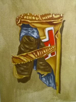
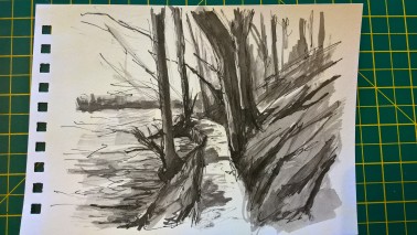
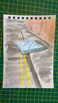
The colours I used were not directly as the Maugy Article, I used what was on my palette – Yellow Ochre, Naples Yellow, Transparent Maroon, Ultramarine and Cerulean Blue – the result is a dirtier, muddier version of the Maugy watercolour and I prefer the drawing but one ticked off. Will I keep them? – long term possibly not but certainly for the new “Archive”

Another pear related article, again an old one from the Artist magazine, this time by artist Ian Sidaway. His original was a gouache painting I think, I just kept the final painting image not the how to.  I enlarged the image and drew it, see below


WP_20170205_16_44_54_Pro (2)

Bag of Pears – Graphite on Paper, A4 – After Ian Sidaway

I found it an interesting and challenging drawing to produce, particularly to get the paper bag to work with the pears. Tonally strong and against the original holds up fairly well. Happy with it


Standard

Spring had sprung…

Before, during and after studying the work of Maria Sibylla Merian, the garden got some scrutiny and went looking for some further inspiration. The above drawings ( Daisy, Daffodils and Fatsia Japonica) are based on photographs I took as well as some found images. The Crocus is an oil colour study on primed paper, I had posted these on other social media sites a few weeks a go so I must have been happy with them and to prove that spring had sprung here in Chesterfield….

Standard