
The course work states “make 3 or more paintings based on your chosen collections” – approximately A4 in size.
With the presented list, the majority seemed to be foodstuff of some sort, chocolate sauce, coffee and Marmite for instance. I use enamel paints but generally as a primer for painting figures, in oils or acrylics as they dry very quick and provide an excellent tooth for the following coats, plus how many paintings would you want in Olive drab? I’ve also used Marmite to weather metal armour but knackered some brushes doing so…
Following a brief email exchange with my tutor, who passed on some very helpful hints, I chose Tea, for the following reasons
- We have loads in the house, different flavours so potential in colours
- Hopefully not too harsh on my brushes – but well clear of my sables!
- Following the relative success of using water based media in Part One – this may not be much of a wild excursion with a bit of experimentation too
- I’ve only used Tea to stain paper to draw on, so painting on it would be a challenge…
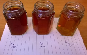
Okay decided on Tea, what next, in truth no idea! what I wanted ideally was 3 strengths to create a light, medium and deep tint to produce some sort of tonal values and do simple paintings.
So the principle was there, the kitchen became some sort of lab and see how we get on… I found some hints too from http://www.snapguide.com regarding brew strengths, see below
- Boil Kettle
- Place 2 teabags of choice into cup/jug – I used 110ml jam jars – 200ml jug to measure
- Pour water onto teabags – leave for 5 minutes
- Squeeze out teabags and remove
- This will be your strongest tone – 1 poured 100ml onto the jam jar
- Pour 100ml boiling water back into the measuring jug
- This will be the mid tone
- Pour 100ml boiling water back into the measuring jug
- This would be the lightest tone
8 Different teas and 24 jam jars later….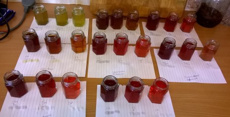
Once I had created the above, the majority of the fruit based teas looked very similar in colour. So then I thought, wonder if I could get 3 “Primary colours” out of this lot – sketchbook came out, created a colour chart to see how they would react, and to be honest I was a little disappointed in that a lot of the berry shades, pinks and oranges painted as if the were blue greys.
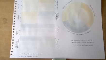
That said, I think 3 basic primaries were achieved so not all doom and gloom…
The green tea – became the Yellow, good old Breakfast Tea became the Red and for the Blue Raspberry, Strawberry and Loganberry. Photo not great but gives the impression I think. How they behave when painting who knows!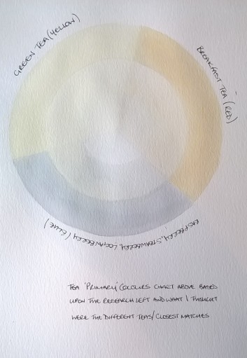
On with the pictures….
I was apprehensive, but on the flip side cautiously optimistic… I used one online image, the humbugs, one direct observation the marbles and one from a previous drawing the dice to try and mix my images up. Below are the results
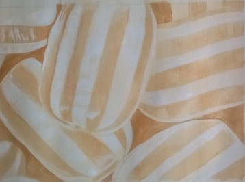
Humbugs – Painted in Breakfast Tea
This was the first one, didn’t turn out too bad. The tea seemed to perform very much like very thin ink rather than watercolour. It took an age to build the darks up and thinking this could look really convincing in oil colour to get the gloss of the sweets but that’s no the point. Fairly happy with it.
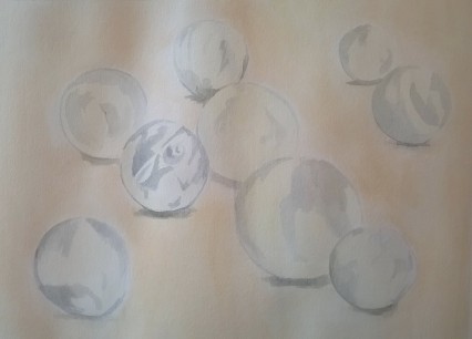
Marbles – Painted in all 3 Primary teas
The marbles picture above was the second produced and whilst you can roughly tell what they are – I wasn’t convinced that these teas could pull the image off as I wanted – it looks weak and rushed – It started ok but I was expecting watercolour results and just not there. Oh well on to the next one.
The third one painted was of some of my gaming dice, and my favourite out of the three and probably shows. The tonal subtly of the dice forms, from the light source and the tonal variance of the tea produced a ghostlike image that I was looking for. Happy
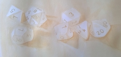
Dice – Breakfast tea
Overall I found it an enjoyable experiment and exercise, probably more making the teas than painting with them. I probably used all my energy in that rather than the image making. The dice picture was a success with me, born out of the drawings I produced earlier, so the investment paid off and probably why the other too are not so, although the Humbugs turned out ok. For all the marble drawings I have done, perhaps in hindsight I should have used the drawings for that picture too as it was the least convincing of the three, perhaps just using one colour tea rather than 3 different ones may have had a different impact…
Tea to Coffee and Exercise 2:1 Large Scale Line Painting…

Pingback: Assignment Two: Sepia Officinalis – Steve Lowen's Drawing Too